Colour is the single most powerful tool in interior design. It sets the mood before a single piece of furniture is placed. Yet it is also one of the decisions that homeowners find most paralyzing. Here is a practical guide from our studio to help you choose a palette that will stand the test of time.
Start With How You Want to Feel
Before you look at swatches, ask yourself how you want each room to feel. Energized and vibrant? Calm and restful? Warm and social? Every colour family carries an emotional weight. Warm tones like terracotta, ochre, and rust create a sense of comfort and intimacy. Cool tones like grey, navy, and sage create a sense of calm and space. Neutral tones like cream, beige, and white create a sense of openness and flexibility. Your answer to this question will immediately narrow your choices by half.
The 60-30-10 Rule
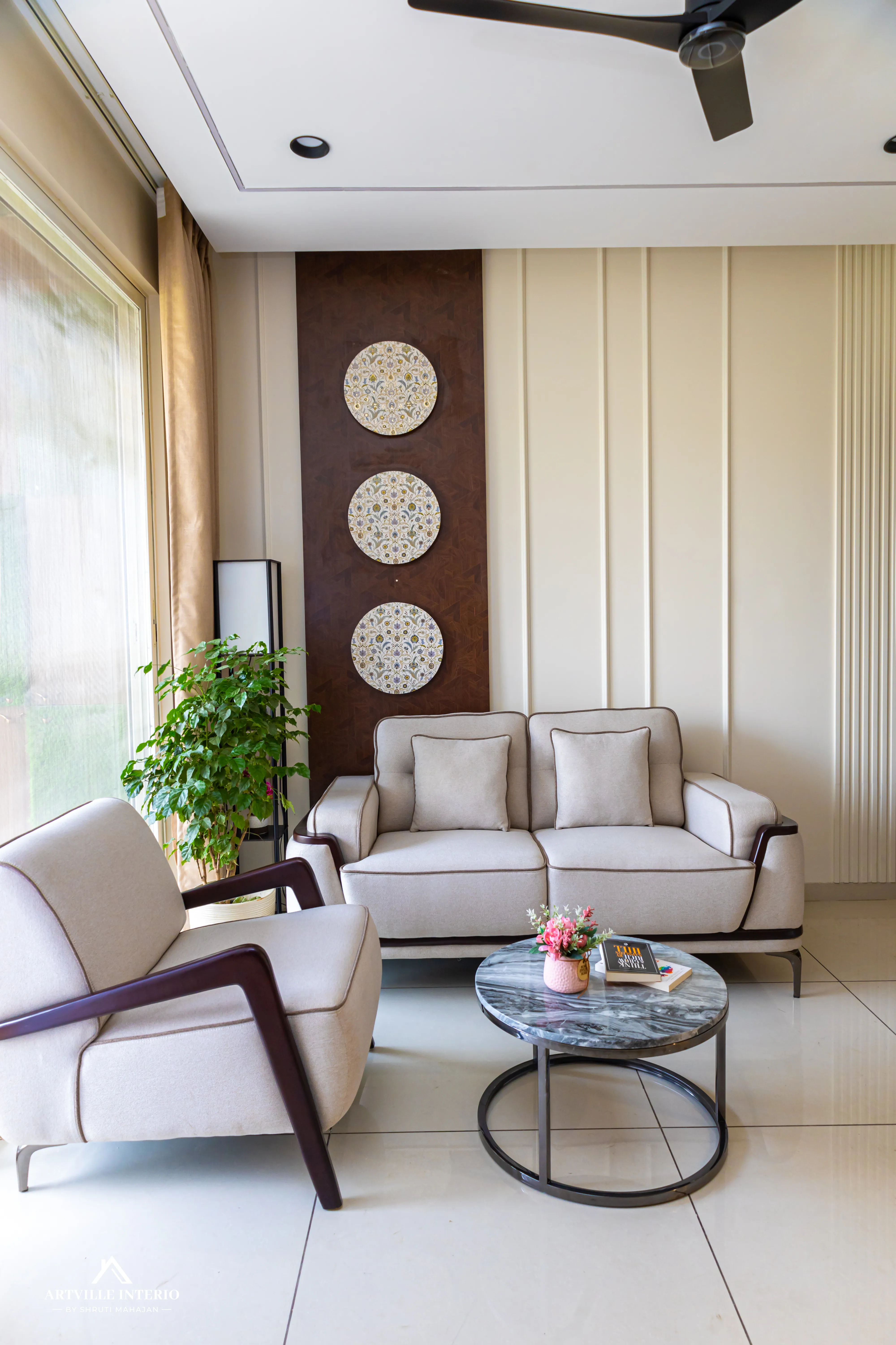
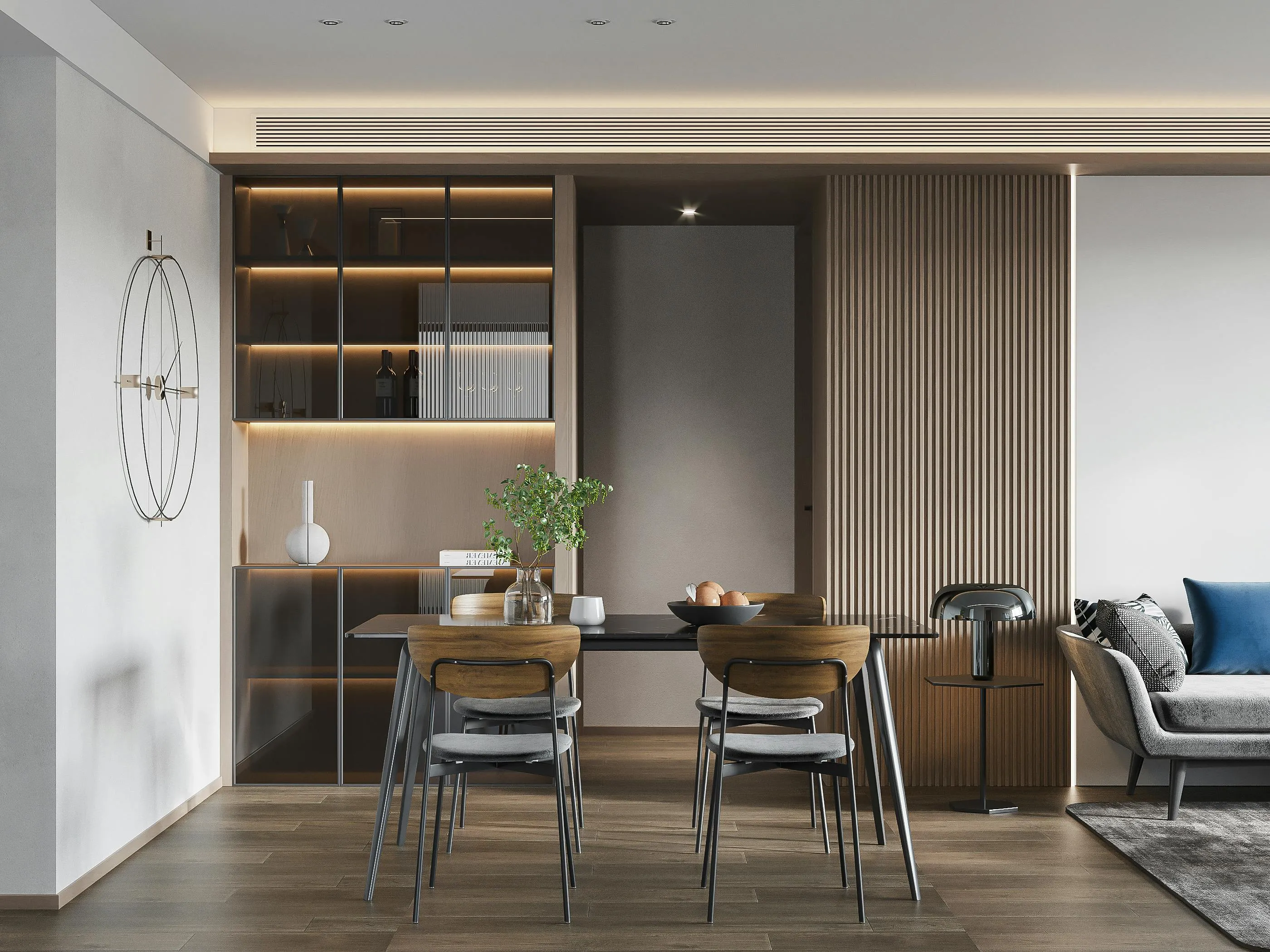
This is the most reliable framework for building a balanced colour scheme. Sixty percent of the room should be your dominant colour — typically the walls and large furniture. Thirty percent should be your secondary colour — upholstery, curtains, and rugs. Ten percent should be your accent colour — cushions, artwork, and decorative objects. In a typical Pune apartment living room, this might look like cream walls (60), a terracotta sofa (30), and brass and green accents (10). The ratio keeps the room from feeling chaotic or flat.
Understand How Light Changes Colour
Natural light in Pune is different from what you see in a European showroom catalogue. Our light is warm and intense, which means colours that look soft and muted in a showroom can appear much richer and deeper on your walls. Always test paint swatches on your actual wall and observe them at different times of day — morning, afternoon, and evening with artificial light. A colour that works beautifully in the morning may feel completely different after sunset. At Artville, we always do a full lighting test before finalizing any palette.
Build Around One Hero Piece
If you already have a sofa, a rug, or an artwork you love, build your palette around it. Pull two or three colours from that piece and use them as your guide. This approach almost always results in a cohesive room because the colours are already in relationship with each other. It also gives the room a sense of intention — like everything belongs together.
Do Not Ignore the Ceiling and Floor
Most people choose their wall colour and forget that the ceiling and floor are also part of the palette. A white ceiling reflects light and makes a room feel taller. A warm off-white ceiling on cream walls creates a cocoon-like warmth. Dark flooring grounds a room and makes it feel anchored. Light flooring makes a room feel airy and open. These two surfaces make up a significant portion of what your eye sees — treat them as intentional choices, not afterthoughts.
A Final Word on Trends
Colour trends change every two to three years. If you paint your entire home in the colour of the year, you may find yourself repainting in three years. Instead, use trendy colours in small, easy-to-change elements — a cushion cover, a vase, a side table. Keep your walls and large furniture in colours that you genuinely love and that feel timeless to you. At Artville, we always design for the long term. A well-chosen palette should feel as right in ten years as it does on day one.
Colour sets the mood before a single piece of furniture is placed. Take your time, test your lights, and trust your feeling.